Cardboard RPG Tile Blending
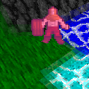
 Cardboard RPG now uses subtle terrain shading to add depth, along with a unique approach to water and tile blending designed to enhance visuals while staying true to the game’s deliberately low-def “2D stylized into 3D” theme.
A downloadable executable of the change is available on Patreon for those interested.
For shading, the game uses a simple GPU-sided method for calculating normals dynamically, then shades the terrain as though it was being lit by a directional light source pointing straight down.
From the start, the central visual theme of the game has been “2D stylized into 3D”. This is also the reason for the game’s use of 2D sprites propped up into 3D. The sprites used by the game are from a CC0 resource called RLTiles that is very obviously intended for 2D games, not 3D. In a way, RLTiles is what originally inspired the “2D stylized into 3D” theme.
Now the question was not only how to properly apply said theme to terrain, but also how it would define the game’s identity in a more general sense. It quickly became clear that trying to make things too “fancy”, e.g. by using a seperate and possibly even animated plane for water, was the wrong way to go, as it would run the risk of the game’s low-def styling looking lazy rather than deliberate. As a result, the game now uses a single plane for all tiles (water or otherwise) much like a 2D game would, with relevant parts of the terrain extruding out of the 2D plane into 3D. Conveniently this also makes things like elevated lakes or rivers going down slopes easier to do.
Finally and perhaps most interestingly, the terrain now features a custom form of texture blending. Doing fully smooth transitions like what higher-def games usually do would’ve again clashed too much with the game’s styling and made it look incoherent and lazy instead of deliberate. Instead of a smooth gradient the texture transitions happen in rough steps that work well with the pixelated textures while still improving the look of the terrain.
Also, the originally planned circular entity shadows have been scrapped as they would require a full-on lighting system with proper shadow mapping, which is outside the scope of this project and would clash with the low-def theme anyway. The purpose of the shadows would’ve been to make entities more easily visible when they’re not facing the player, but this likely won’t be an issue as entities that are attacking the player will usually be facing them.